Few months after your wedding, you start to receive loads of breathtaking wedding photos from your wedding photographer. Apart from saving all the photos in a tiny USB or on the cloud, making a wedding photo album in Melbourne still remained as one of the most popular choices for couples.
The advantage of having your own wedding album is obvious: comparing to looking at the computer screen, the process of unfolding your wedding album gives you a sense of ceremony, which it kind of, turns back time and takes you back onto your wedding day. A wedding album also provides a more immersive storytelling experience.
Lots of wedding couple leaves their album work to their wedding photographer: This means the wedding photographer will do most of the work for them: including choosing a layout style, their album’s cover, and texture.
But have you ever thought about designing your own wedding album? Ditch those cliché styled wedding albums which all of them looked that they came out from one same preset. By having controlling of all the little bits, you can make your own unique wedding album in Melbourne.
“But I know nothing about graphic designing”, “ I don’t know what I want in my wedding album”. Don’t worry, you could follow my 5 tips on designing an impressive wedding album.
Selecting your wedding photos
A standard wedding photo album has 10 pages and each page has 2 sides. Usually, around 40-50 photos should be chosen by the wedding couple to put into the wedding album to make the album’s story more comprehensive.
A wedding album should tell a couple’s wedding story in a narrative way. The story starts from:
- groom and bride’s preparation
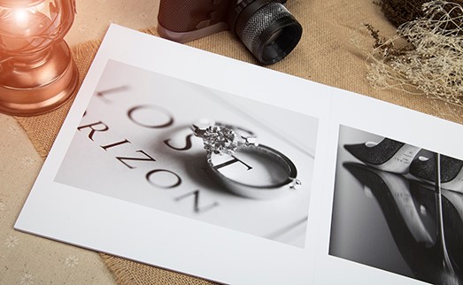
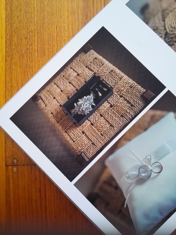
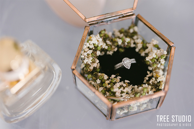
- groom and bride’s accessories photo
- ceremony
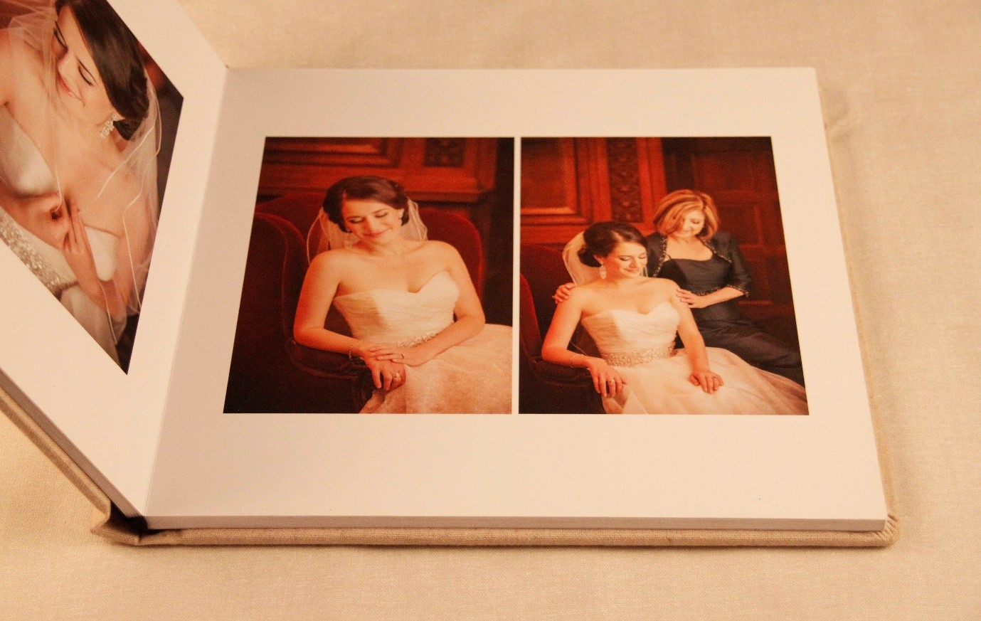
- family photos
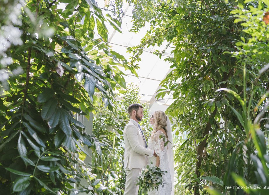
- wedding location photos
- reception
Most of the wedding photographers would select the highlight photos from the wedding day to make the wedding album. For instance, couple’s wedding location photos, landscape and some key moments. When you are designing your own wedding album, you can select your wedding photos from your point of view. For instance, your family photos as well as some cherish moments on your big day.
Once the wedding photographer receives the collection from you. Color corrections of each photo will be carried out to ensure the color consistency, in term of brightness and color temperature.
Wedding photo album cover and paper
Choosing wedding album’s cover
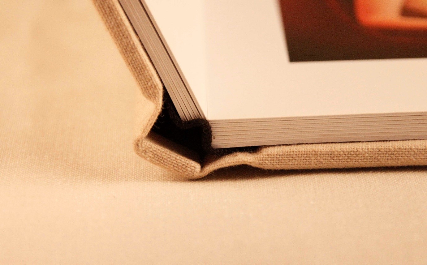
There are various options in regard to the texture of a wedding album’s cover: fabric, leather-bound and acrylic. You can select a preferred texture so that the album would fit with your wedding style and theme seamlessly.
What wedding album cover shall I choose?
- Wedding style– A rustic country wedding fits seamlessly with an ivory fabric cover. A classic city wedding never goes wrong with a black leather cover. A champagne leather-bound album would match with a modern wedding.
- Home interior design-think about your live environment and home interior design. A light color of wedding album cover would work perfectly with a modern interior design.
The fabric wedding album cover would suit an eco-friendly home and oak wood furniture.
The leather-bound album cover would suit a classic and urban house.
Personalize your wedding album cover
To make your wedding album even more personalized, you can add you and your partner’s name on the album cover. What’s more, you can choose the finish of your name prints. The most popular ones include ink as well as foil embossed prints, which suits to fabric textured and leather textured respectively.
Choosing the finish of the paper
A wedding album paper’s finish come in two choices: glossy and matted.
What are the key differences between them?
Glossy Finish: generally, a glossy paper wedding album has a rich and vibrant color. Due to reflective texture, the images on paper are shinier.
The con of the gloss paper is that your fingerprint would leave on the gloss paper and it might have glare effect when the direct light lit on the album paper, particular the sunlight.
Matte: The colors of a matted wedding album generally are more neutral and muted.
There are few advantages of Matte paper.
Firstly, you don’t need to worry about fingerprint.
Another advantage of the matted papers is they tend to be not as strongly reflective as its rival, this means there will be less reflections or glares especially when you are looking at your wedding album under downlights.
Paper thickness
A wedding album with high-end fine-art print paper has a thickness of approximate 1mm on each spread. Having a proper thickness adds strength to the paper hence preventing creases on your wedding album.
Which software do pro wedding photographers use for designing layouts of wedding albums?
There is some software to create a layout for your own album. Some software has much more features and thus more complex, which are often aimed for a more professional user. Some software is easier to use and offers a more straightforward user experience.
- The pro software for designing layout for wedding albums:
- Photoshop
- InDesign
Pros: professional software let you have more control to create your own custom album. In Photoshop, you can do color correction, retouch, album layout.
Cons: The professional software offers no template for a wedding album meaning it is more time.
- The ‘shortcut’ software for wedding album layout design
- Fundy album builder
- FotoFusion
Pros: Easy to use, many templates to choose from and they also provide background for the album photos.
Cons: You can’t do retouch on the software. All the wedding album layout look similar because overly using a template.
For my personal preference, I use photoshop or InDesign to design wedding album layout as I always come out a new ideas and also I can make the wedding album design according to the couple’s preference.
What to think when designing layout for your wedding album
Tell a story
The wedding album would basically reflect everything about your big day. You definitely should put the money shots and great location photos into your wedding album, but never forget about your getting ready, ceremony and reception photos to make the story completely.
Think Chronologically
A good wedding album layout should tell story in a timeline order, so when other people look at your wedding album, they would easily understand and imagine what happened on the day.
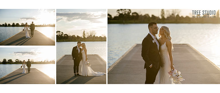
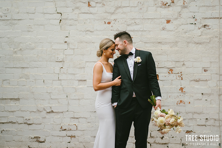
By following the wedding timeline, the story should start from the getting ready in the morning all the way towards the reception at the night. For the front cover, you could select one highlight photo from your location photos that has just the bride and groom. The front cover photo provides a statement on who they are and where is the wedding.
A great typography
To process the wedding album layout is second creation. A great typography can make your wedding album looks even more impressive.
You could choose multiply photos (4 to 6) on one side and one landscape photo stretch across two sides. It creates a variable layout. For instance, few bride’s accessory can put one side page. One great location photo span two sides.
One little tips, it is not advisable to put too many family photos on one page because you can’t see clear on every people face.
Leave a white space
When designing your wedding album, it is important to avoid your photos cover whole page. A fully loaded wedding album will look too busy and overwhelming. Each photo and group of photos should have some white space between other.
Also, the edge of wedding album shall leave at least 5mm bleed. To ensure the important part of photo is not trimmed off in the album process, it is advisable to leave 15 mm space on edge.
Attention to details
Although most modern wedding photo album has a seamless bound technique used between two sides. It still has a shallow mark in middle of joint zone.
A rule of thumb: the album layout shall avoid people’s face on the joint area.
Have a chat with your album designer
You can select the top 40 favorite wedding photos of yours and request your wedding album designer to help you. I know you’re really anticipated to receive the handmade wedding album. But good things do take times, before we send the order to the printing lab, we always provide a PDF preview version of the wedding album to let you double check if the wedding album layout is to your liking.
If you have your own ideas and want the album that is made to suit your preference, you are welcome to visit Tree studio and enhance the wedding album with our editor in person. Alternatively, you could have a Skype or Zoom meeting, you could see the album design screen and make the change with our album designer in real time.
If you have curiosity about Melbourne wedding album price or have more questions about the wedding photo album design, you could contact us.


